Graham Process Mapping
or Box and Arrow Flowchart
Facts do not cease to exist because they are ignored. - Aldous Huxley
.gif)
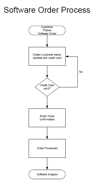
Here's a box and arrow flowchart of a simple software order process.
Click here to see the detail...
Since processing software orders is something that we do here, we modified text in the flowchart slightly to reflect our process (The number of activities and decisions are the same.)
Click here to see the detail...
Since processing software orders is something that we do here, we modified text in the flowchart slightly to reflect our process (The number of activities and decisions are the same.)
View a readable map (113k pdf)
.gif)